 Online
 Online
 Online
 OnlineOnlineOnlineOnlineOnline
 Online
 OnlineOnlineOnlineOnlineOnlineOnlineOnline
 OnlineOnlineOnlineOnlineOnlineOnlineOnlineOnline
All images are of models and are used for illustrative purposes only.
Video Chat That Starts Faster and Feels Easier to Control
Browser-first live conversation without a heavy setup wall

Video Chat
Open the session quickly, keep the first interaction readable, and move on cleanly when the match is weak. The product should help you test a conversation, not trap you in setup.
Frequently Asked Questions
Yes. The core entry should let you test the live flow before any upsell becomes the main event. If optional extras appear later, they should be labeled clearly in the interface.
The page is built around lower friction, clearer control, and safer first contact. Instead of burying the user under profiles or vague promises, it focuses on live sessions, skip clarity, and visible safety tools.
Yes. The experience is still about meeting someone new quickly, but it is framed with more control over how the session begins and how you leave it if the match is wrong.
Fast exit, reporting, community rules, and MatchBlur matter most in the first moments. They help reduce unwanted exposure while you decide whether a conversation deserves more trust.
No. The page is designed so the first session can begin without forcing a heavy registration flow before the product proves itself.
Yes. The core flow is built to work in modern mobile browsers, though the actual experience still depends on permissions, device quality, and connection stability.

Built for people who want live conversation without profile drag, confusing walls, or unnecessary exposure in the first seconds. The product is designed to make meeting someone new feel quicker, clearer, and easier to leave when it is not a fit.
1v1 Video Chat if you want to continue in a calmer one-to-one format.Human Connection Redefined

1 on 1 Chat: quieter conversations with clearer attention
Use a direct one-to-one route when you want calmer pacing, less social clutter, and an easier way to leave a weak match without room noise.

Discovery paths: broader entry before you narrow
Explore the wider live-chat cluster first when you want to understand which format fits your intent before committing to one route.

Better follow-through after a strong first chat
When a session works, the next step should feel natural. Good interaction design makes it easier to continue a promising conversation instead of losing momentum.
Elevate Your Video Chatting Experience
Additional layers that improve entry quality and first-contact comfort.

Readable first impressions instead of instant overload
The opening moments should help the user read tone, energy, and comfort quickly, without forcing full exposure too early.

Card-style sorting that supports intent, not vanity
Light browsing works best when it helps the user narrow options before the session, not when it turns the product into another profile-heavy feed.
Unlock the Magic

Use stable light and a steady connection so the first conversation feels easy to read.

Keep your opener simple. A calm greeting performs better than trying to impress too hard.

Leave weak sessions early. Good live chat depends as much on exits as on matches.

Share personal information slowly. Let the conversation earn more trust first.

Use report tools when something feels wrong so the space stays cleaner for everyone.
What Our Fans Say
"I was skeptical at first, but this surprised me. The quality of people here is amazing! I've had some fantastic conversations and made some real connections."

David
Artist
"Video chat makes a huge difference! I can instantly gauge someone's personality and see if we click. Plus, the quality of the connections is top-notch."

Emily
Model
"So glad I found this! I've met some incredibly inspiring people here. It's been a fantastic way to expand my network and make new friends with shared goals."

Michael
Pilot
"This isn't your average online chat app! I've met some incredibly interesting people here - entrepreneurs, artists, even a travel blogger! It's refreshing to connect with such a high-quality crowd."

Sarah
Marketing Director
"I finally found a platform where conversations are stimulating and inspiring. Met some amazing people who share my passions and drive."

Olivia
Model
"Love that this focuses on quality, not quantity. Makes a huge difference in the caliber of people you meet. Feels refreshing to connect with like-minded individuals."

Priya
Investor
"I was skeptical at first, but this surprised me. The quality of people here is amazing! I've had some fantastic conversations and made some real connections."
David
Artist
Why the homepage matters on a site like this
A lot of random video chat homepages fail because they try to sound bigger than they are. They stack vague promises about meeting people worldwide, then bury the practical questions that actually decide whether someone clicks: how fast does this start, how do I leave, and what happens if the first match feels wrong?
The homepage should answer those questions immediately. It should make the live format feel simple, show that control exists before the user is exposed too early, and explain where to go next if the broad query turns into a more specific need.
That is why this page routes naturally into video chat, anonymous chat, 1v1 video chat, chat rooms, and our Omegle alternative page. The goal is not to trap the reader on a generic homepage. The goal is to get them into the right live path fast.
What this homepage is doing differently
Instead of acting like a generic company front page, the homepage works as a broad-entry landing page for the whole live-chat cluster.
Fast browser-first entry
The page is built around helping the user start quickly in the browser before asking for deeper commitment.
Visible safety framing
MatchBlur, reporting, and fast exits are presented as part of the product logic, not as an afterthought.
Broad live intent
The homepage serves users who want random video chat without forcing them into a narrower page too early.
Lower identity pressure
The product stays easier to test when the user does not have to build a profile before the first conversation.
Momentum-friendly reset
A bad match should be easy to leave so the session can keep moving instead of collapsing into friction.
Clear next-step paths
If the user wants more privacy, more focus, or more structure, the homepage already points to the right commercial sibling.
Fast browser-first entry
Online chat feels faster here because the browser is doing the heavy lifting. WebRTC handles the real-time media session, while standard browser technology and browser APIs manage camera permission, microphone access, device switching, and connection setup. That is what makes no download video chat and instant access realistic instead of just promotional language. The user is working inside a tool they already trust and already know how to leave.
Friction occurs during complicated setup processes in traditional video chat platforms. It shows up when the user has to download an app, verify an email, build a profile, and wait through multiple prompts before they can judge whether the first conversation is even worth having. Friction is reduced by the browser-first video chat approach because the homepage shortens the distance between curiosity and the first live test.
That technical innovation changes the emotional rhythm too. Friction prevents smooth transition between matches and conversations when every reset feels like restarting an onboarding funnel. Here, the setup barriers are lower, so a weak first match does not automatically kill momentum. The user can enter, assess, skip, and continue with less wasted time and less pressure.
- No app store visit before the first session.
- No profile-heavy setup before the product proves it can support a real conversation.
- No long re-entry cycle when a user wants to move from one match to the next.
Privacy Features Explained
Privacy is not treated as a decorative promise on this homepage. Privacy is maintained by MatchBlur technology during initial contact, which means the first visual layer of the conversation is intentionally softened until both people feel comfortable moving further. That directly addresses one of the biggest causes of exposure anxiety in video chat safety: the fear of being fully visible before you have any sense of the other person, their tone, or whether the session feels respectful.
MatchBlur works as progressive disclosure rather than all-or-nothing anonymity. The first stage keeps visual detail partially obscured so the user can confirm that audio, tone, and basic social fit feel normal. The next stage allows the conversation to stabilize before a fuller reveal happens. Privacy enables comfortable conversation testing without full exposure, which is a more practical privacy control than the competitor pattern of showing everything immediately and offering only block or report tools after the user already feels overexposed.
That difference matters in real situations. A first-time user joining late at night can keep MatchBlur active while checking whether the conversation feels calm. Someone chatting from a shared apartment can decide whether the other person seems trustworthy before becoming fully visible. A user who senses awkward energy in the first few seconds can leave with user protection still intact, because the privacy features did their job before the conversation became too revealing. In that sense, MatchBlur is not only a visual effect. It is a working privacy control that supports safer, more confident entry into live video chat.
- Competitors often treat privacy controls as a recovery tool after exposure. MatchBlur starts earlier and gives the user more control before the reveal.
- Reporting and fast exits still matter, but they work better when the user has already had a protected first layer of contact.
- The platform keeps user protection practical: test the tone, decide whether to continue, and reveal more only when the session earns it.
Optimized Mobile Browser Experience
Mobile video chat only works well when the interface respects the limits of a small screen and a touch-first context. The homepage is built with responsive design that keeps the main CTA, exit logic, and core privacy controls readable without forcing the user through cramped desktop patterns on a phone. Touch targets stay large, text hierarchy stays clear, and the entry flow avoids the kind of stacked modal chaos that often breaks mobile performance.
The browser optimization also has a practical network side. Mobile connections shift more often than desktop ones, so the page is designed to keep the first session light and easy to restart. That improves cross-device compatibility because the same online chat flow still feels usable whether someone joins from a laptop, a newer phone, or a smaller mobile browser tab.
- For the best mobile performance, start with a stable connection and test audio before revealing more of the conversation.
- If you want even more distance on mobile, combine MatchBlur with the anonymous chat path before moving into a more open session.
Cross-Platform Consistency
A strong cross-platform experience means the user does not have to relearn the service every time they switch devices. The same online chat logic should hold on desktop Chrome, mobile Safari, Edge, or another modern browser: the entry is browser-first, MatchBlur stays visible, exits remain simple, and the same sibling routes are available when the user wants a narrower path.
That consistency is partly a design discipline and partly a technical choice. By keeping the core flow inside responsive browser-native patterns instead of pushing device-specific app behavior first, the platform preserves a consistent design language. A user can test on a phone, return on a laptop later, and still find the same core capabilities in the same order.
Performance Without Drag
In physics, drag is the resisting force that slows motion. Here, Drag is a useful metaphor for slow performance in traditional video chat applications, because it describes the resistance that prevents smooth user experience. That resistance appears as bloated app startup, laggy transitions, frozen previews, or too many blocking steps before the camera session becomes stable.
This homepage is designed to reduce that technical drag. The browser-first architecture keeps the pre-chat state lighter, the controls more legible, and the transition into the live session more direct. Better video chat performance, lag reduction, and platform speed do not just make the interface look cleaner. They improve conversation quality because people can focus on each other instead of negotiating avoidable delays.
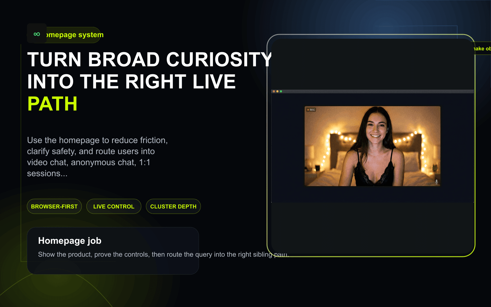
Visual guide
What the homepage should make obvious before the first click
A strong homepage should not behave like a generic startup brochure. It should show how the live product starts, what control feels like, and where different intents go next inside the cluster.
When the homepage is the right place to start
Broad intent is not weak intent. It usually means the user knows the category they want, but not yet the exact path inside it.
You want the broad random-video-chat format first
Use the homepage when you want the live product without pre-committing to anonymous-only, 1:1-only, or room-style behavior.
You are comparing the site at the product level
This is the right entry point when you want to judge speed, safety cues, and cluster depth before narrowing into a specific query.
You need the homepage to route you correctly
Move from here into Omegle alternative, video chat, anonymous chat, or chat rooms depending on what matters most.
You care about experience more than abstract claims
The broad head page should let you assess whether the product feels easy to start, easy to leave, and easy to keep using.
How to use the homepage well
A strong homepage should help the user make a good first decision in under a minute.
Start from the live product
Use the primary CTA to test how the browser flow feels before you overread the page.
Pressure-test the controls
Check whether MatchBlur, exits, and reporting feel visible enough that the product earns another minute of trust.
Branch only when your intent sharpens
If privacy becomes the first filter, move to anonymous chat. If you want calmer direct sessions, move to 1v1 video chat.
Privacy Controls for New Users
Privacy works best on this homepage when the user treats it like a spectrum, not a binary switch. Some people will be comfortable moving into open video quickly. Others will want more anonymous options, slower visual disclosure, and tighter privacy configuration during the first few sessions. The platform is built to support that adjustment rather than forcing everyone through the same social pace.
- 1Start with MatchBlur fully active and test the first few seconds for tone, pacing, and respect before revealing more.
- 2Keep your first session light: do not share personal identifiers immediately, and use quick exits if the conversation starts with pressure or awkwardness.
- 3If your privacy concerns are higher from the start, move directly into the anonymous chat option. Privacy relates to the anonymous chat option for users with higher privacy concerns because it gives them a softer first layer of contact.
- 4After two or three sessions, decide whether to stay in the broader flow or keep your privacy settings stricter. The right configuration is the one that lets you keep control without killing your willingness to keep talking.
What separates a useful homepage from a generic one
Most front pages in this category still read like vague marketing shells. A stronger homepage behaves like a broad but practical commercial landing page.
| Decision point | Typical generic homepage | This homepage |
|---|---|---|
| First impression | Talks about meeting people but delays the product logic. | Explains the live format, safety controls, and first-session flow immediately. |
| Safety framing | Treats safety like a trust badge instead of a system. | Shows control through MatchBlur, reporting, and easier exits before the session starts. |
| Intent routing | Forces everyone through one vague entry path. | Routes users into video chat, anonymous chat, 1v1 video chat, or chat rooms naturally. |
| Commercial value | Acts like a brochure and hopes the user keeps scrolling. | Works like a head-term landing page that helps the user act fast. |
A homepage in this category should do more than say “start chatting”
The user already knows what random video chat is. The homepage does not need to explain the internet to them. It needs to show why this product is worth trying first and why the first session is likely to feel lighter than on a heavier app-first competitor.
That is why the copy on this page is focused on startup speed, session control, and cluster navigation. Those are the elements that make a broad homepage commercially useful rather than just decorative.
If the broad term still feels too wide for what you need, narrow immediately into Omegle alternative for replacement intent, anonymous chat for privacy-led sessions, or 1v1 video chat for calmer direct conversations.
The broad page should lower uncertainty, not add more hype
People do not trust this category because a homepage says “best” a few times. They trust it when the product logic feels legible. Can I start without an app? Can I stay hidden a little longer? Can I leave a bad conversation fast? The homepage should make those answers visible.
That same principle improves SEO as well. A strong homepage satisfies the broad head term by covering the format at a system level while still pushing the user into the right commercial sibling when their intent sharpens.
- Use video chat when you want the broadest live category page.
- Use chat rooms when you want more structure and social context.
- Use Best Omegle Alternatives 2026 when you need the editorial market view before clicking into the product.
Human Connection Redefined
The homepage is not only trying to make random video chat faster. It is trying to make the first human contact feel more workable. Better browser entry, stronger privacy controls, and lighter resets all change how people show up socially. When the system feels less heavy, users waste less attention on setup anxiety and more attention on the actual person in front of them.
That is why the product experience matters at both a technical and social level. A cleaner online chat flow creates more room for curiosity, timing, and better listening. It does not guarantee a meaningful connection every time, but it does create conditions where a meaningful connection has a better chance to start.
Conversation Energy
Energy in this context is not about hype. It is the feeling that a conversation has momentum, responsiveness, and enough comfort to keep going. Energy is preserved by efficient video chat design because the user is not spending their first minute fighting lag, awkward reveal timing, or heavy reset friction. Energy also relates to user engagement and conversation quality: when the setup feels lighter, attention stays on the exchange instead of the interface.
Users can help that process too. Start with a low-pressure opener, notice early whether the other person is matching your pace, and transition topics before the conversation stalls completely. If the energy drops beyond recovery, leave cleanly and reset. That is better than dragging a dead session forward until both people disengage.
- Open with something easy to answer so the other person can join the rhythm without social strain.
- Watch for energy shifts early: shorter replies, slower timing, or forced laughter usually mean the topic needs to change.
- If a session no longer feels alive, reset quickly and keep your chat momentum for the next match instead of spending it on recovery.
Start with the strongest commercial paths
These pages cover the main intent splits that broad homepage users usually need next.
Use this if you want the broadest live format page after the homepage.
Use this if your broad query is really a replacement query in disguise.
Use this if lower identity pressure and more privacy are your first filters.
Use editorial guides only when you need deeper context
The homepage should stay commercial and usable, but these guides help when the reader needs comparison or safety context before deciding.
Use this when you want the editorial market scan instead of jumping straight into the product.
Use this when the main question behind your click is trust and guardrails.
Use this if you want practical advice on making live stranger-chat sessions work better.
Start from the broad head page, then narrow only if you need to
The homepage should make the first live test feel simple. Start the browser-first flow now, then move deeper into the cluster only when your specific use case becomes clearer.